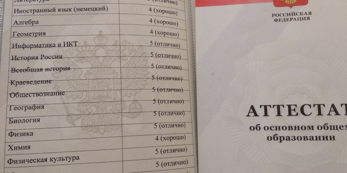
Designing a nursery is one of the most exciting parts of preparing for a baby’s arrival. While parents often focus on furniture, storage, and safety, color plays an equally important role that shouldn't be overlooked. In fact, the choice of colors in a nursery can influence a baby’s mood, behavior, and even developmental progress. This is where color psychology comes into play, helping nursery design services create spaces that are not only beautiful but also nurturing and supportive.
Why Color Matters for Babies
Color psychology is the study of how colors affect human emotions and behavior. Although much of this research focuses on adults, babies are also highly receptive to visual stimuli, especially in their early months when their senses are rapidly developing. While infants can only see high-contrast colors in the first few weeks, their vision quickly evolves, making them sensitive to a broader range of hues. By strategically using color, nursery designers can create environments that are both calming and stimulating, depending on the needs of the child.
Neutral Colors: A Soothing Foundation
Neutral tones like soft whites, beiges, and grays are commonly used in nurseries for their soothing effect. These colors provide a serene backdrop that allows for rest and relaxation, essential for babies who need ample sleep. Neutral palettes also offer versatility, making it easier for parents to update the room as their child grows. Moreover, these tones are ideal for layering with other colors or decorative elements without overwhelming the space.
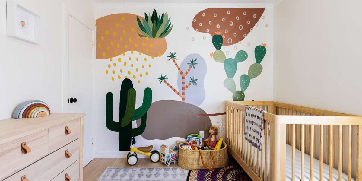
Pastels: Gentle and Comforting Hues
Pastel colors, such as baby blue, soft pink, mint green, and lavender, are classic nursery choices that bring subtle warmth and comfort. From a psychological perspective, these hues are associated with calmness and emotional balance. Light blue, for example, is believed to lower heart rates and reduce anxiety. It’s a great choice for promoting restful sleep and a tranquil atmosphere. Soft pink is linked with feelings of love and nurturing, making it an excellent option for creating a cozy and affectionate space.
Warm Tones: Brightness in Moderation
Warm colors like yellow, peach, and coral can bring energy and cheerfulness to a nursery. However, they should be used in moderation. While yellow is associated with happiness and creativity, overly bright shades can be overstimulating, especially for newborns. A pale yellow accent wall or accessories in cheerful tones can provide just enough brightness to uplift the space without causing sensory overload. Balance is key when incorporating these more vibrant shades.
Green: A Natural and Calming Choice
Green is another popular color in nursery design, often chosen for its associations with nature, growth, and harmony. Psychologically, green is considered restful for the eyes and can create a nurturing and peaceful environment. It’s a great gender-neutral option that works well with both modern and traditional design themes. Soft shades of green are also thought to support concentration and learning, which may benefit babies as they grow into toddlers.
Use of Bold Colors: Striking but Strategic
On the other hand, bold or intense colors like red, deep purple, or bright orange can be overwhelming in a nursery setting. While these colors can add visual interest, they’re best used sparingly. Red, in particular, is known to increase energy levels and even heart rate, which might not be ideal in a space meant for sleep and relaxation. If these colors are favorites of the parents, they can still be introduced through accents such as pillows, wall art, or toys.
Designing for Sensory and Developmental Needs
Color psychology also plays a crucial role in designing nurseries for children with sensory sensitivities or developmental conditions. Soft lighting, muted tones, and carefully curated color schemes can help create environments that reduce anxiety and encourage focus. Nursery design services that specialize in inclusive and therapeutic spaces often rely heavily on color theory to meet these unique needs.
Modern Trends: Minimalism Meets Psychology
In recent years, more parents have opted for minimalist or Scandinavian-inspired nursery designs, featuring monochromatic or limited color palettes. These designs emphasize simplicity and tranquility, aligning with color psychology principles that support calm and clarity. White, beige, and natural wood tones dominate these spaces, offering a peaceful ambiance that benefits both babies and parents.
The Impact of Color-Informed Nursery Design Services
When nursery design services apply color psychology, they go beyond aesthetics to create functional spaces that support early development. The use of color can influence everything from sleep patterns to emotional well-being. By understanding the psychological effects of color, designers can offer personalized guidance that aligns with each family’s goals, preferences, and lifestyle.
Conclusion
In conclusion, color psychology plays an integral role in nursery design services by shaping how a space feels and functions. Whether the goal is to create a soothing sanctuary for sleep, a cheerful area for play, or a balanced room that evolves with the child, thoughtful color choices make a significant impact. For parents seeking to create the best environment for their baby, working with a design service that understands the power of color can make all the difference.