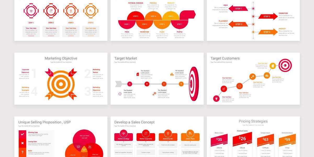
From selecting colors and fonts to aligning content and maintaining visual consistency, it’s easy to spend more time designing than crafting the actual message. This is where PowerPoint templates come in—not just as time-savers, but as stress-relievers for anyone who wants to create beautiful presentations without the headaches. The key, however, is not just using templates but using them right. Below, we explore expert tips on how to make the most of PowerPoint templates to minimize design hassles and maximize clarity.
1. Start with the Right Template
Not all PowerPoint templates are created equal. Choosing the right one is the first step in reducing future frustrations. You should look for a template that matches the tone, audience, and purpose of your presentation. Is it for a sales pitch, a quarterly review, or a creative proposal? Make sure the layout and design reflect the context.
A great template will already have:
A consistent color palette
Harmonious fonts
Pre-aligned placeholders
Multiple slide layouts (title, content, comparison, charts, etc.)
Avoid templates that look flashy but lack structural versatility. These often cause problems down the line when you try to fit real content into them.
2. Stick to the Built-In Master Slides
One of the most overlooked features of PowerPoint templates is the Slide Master. This tool allows you to control the overall look and feel of your slides in one place. When you use the master slides, you’re not just saving time—you’re protecting yourself from inconsistent formatting and tedious slide-by-slide edits.
To access the Slide Master, go to the “View” tab and select “Slide Master.” From here, you can:
Modify font styles across all slides
Adjust logo placement
Add footers or page numbers
Lock in branded colors
By editing the master slide instead of individual slides, you ensure a cohesive look with much less manual effort.
3. Use Layouts as They Were Intended
Each layout in a template is designed for a specific type of content. Resist the urge to hack a title slide into a text-heavy agenda or cram images into a bullet list slide. Misusing layouts often leads to poor alignment, text overflows, and inconsistent visuals that are a pain to fix.
Instead:
Use title slides for section breaks or introductions
Use content slides for text, charts, or visuals
Use comparison slides for side-by-side content
If your content doesn’t quite fit, it’s better to switch to a more suitable layout or duplicate and modify an existing one rather than force it into a poor fit.
4. Keep Your Font Choices Consistent
One of the fastest ways a presentation starts to look messy is inconsistent fonts. Stick with the fonts already used in the PowerPoint template unless you have a compelling reason to change. Ideally, use no more than two font families throughout your presentation: one for headings and one for body text.
Also, be careful with font size. PowerPoint templates typically assign appropriate sizes for titles, subtitles, and body text. Modifying these arbitrarily can disrupt the balance and hierarchy of your slides.
5. Align Content with Gridlines and Guides
Proper alignment is crucial for visual harmony. Many templates come with built-in guides and gridlines—use them. These invisible design helpers make it easy to align text boxes, images, and shapes without eyeballing everything.
To turn them on:
Go to the “View” tab
Enable “Guides” and “Gridlines”
Dragging objects will now snap to alignment lines, helping you avoid one-pixel-off frustrations that plague manual adjustments.
6. Limit Color Changes
Templates come with a predefined color scheme, often based on brand colors or complementary tones. Straying too far from these presets can result in slides that clash visually or become unreadable.
When you must introduce a new color—say, to highlight a particular data point—make sure it complements the existing palette. A good rule of thumb is to use accent colors sparingly and maintain contrast for readability.
7. Replace, Don’t Resize, Icons and Images
Icons and placeholder images in PowerPoint templates are more than just decoration—they are pre-sized and positioned to maintain design balance. Rather than resizing these elements (which often breaks alignment and proportion), replace them with similarly sized images or icons.
Use tools like PowerPoint’s built-in icon library or image insert options to drop in new assets. Doing so preserves spacing and scale while refreshing your visual content.
8. Use Format Painter to Match Styles Quickly
When you want two text boxes or shapes to look identical, avoid manually matching fonts, sizes, colors, and spacing. Instead, use the Format Painter.
To use it:
Click the object with the desired formatting
Click “Format Painter” in the Home tab
Click the object you want to format
It’s a simple tool, but one that can drastically cut down on repetitive design tasks and ensure uniformity.
9. Avoid Crowding Slides with Too Much Content
Even with a well-designed template, overloading your slides with too much text or too many images creates chaos. Templates are built with a certain content density in mind. Respect that spacing.
Follow these best practices:
Limit to one main idea per slide
Use bullet points sparingly (4–6 max)
Favor visuals over text where possible
The cleaner your slides, the more effective your message—and the less you’ll have to wrestle with spacing issues.
10. Customize Theme Colors and Fonts Before You Begin
If you're working with a template that’s close but not perfect, it's better to tweak the theme settings before you start adding slides. This includes:
Customizing theme colors
Choosing different font sets
Adjusting background styles
Doing this early saves you from the painful task of adjusting every slide later on and ensures consistency from the start.
To update the theme:
Go to the “Design” tab
Click on “Variants”
Choose “Colors” or “Fonts” to customize
This approach maintains the structure and integrity of the template while tailoring it to your needs.
11. Leverage Content Placeholders—Don’t Delete Them
Content placeholders in templates are not just arbitrary boxes; they’re positioned and formatted to match the design. Deleting them and replacing them with new shapes or text boxes disrupts that built-in harmony.
Instead of deleting:
Click into the placeholder and paste your content
If the placeholder doesn't match what you need, try switching the slide layout
This keeps the template’s internal spacing and alignment logic intact, which saves you the trouble of realigning things manually.
12. Save Your Custom Template for Future Use
After you’ve spent time tweaking a template to your brand or presentation needs, save it as a custom PowerPoint template file (.potx). This ensures that your effort pays off beyond a single use and makes it easier for your team to stay on-brand.
To save:
Click “File” > “Save As”
Choose “PowerPoint Template (.potx)” as the file type
Next time you start a presentation, you can open this file instead of redoing the customizations.
13. Test the Template on Multiple Devices
Before finalizing your deck, preview it on different devices or projectors. Sometimes what looks perfect on your screen may appear off on another due to resolution or font differences. Templates help reduce this risk, but it's wise to double-check—especially if you're presenting on someone else's equipment.
Use PowerPoint’s “Slide Show” mode and export a PDF version as backup. This adds an extra layer of security and reduces the chance of last-minute display issues.
14. Keep a Clean Copy of the Template
Always keep a clean version of your chosen template untouched. As you build out your presentation, you may accidentally alter or delete essential elements. Having a fresh, original version means you can easily recover slides or design elements without starting from scratch.
Store this clean file separately and avoid overwriting it during your edits.
Conclusion
Smart use of PowerPoint templates can transform presentation creation from a tedious chore into a streamlined, even enjoyable task. By understanding the structure behind templates and respecting their built-in logic, you can focus less on design headaches and more on crafting a clear, compelling message.
With the right approach, templates aren’t just shortcuts—they’re your blueprint for professional-grade presentations that impress without the stress. Whether you're creating slides for a board meeting, product launch, or educational session, these tips will help you maintain visual consistency, save time, and deliver with confidence—all without needing to be a graphic designer.
By leveraging PowerPoint templates properly, you set yourself up not only for efficiency but for excellence.


